EXP2
Axonometric
1. Dimly lighted straight corridor - evokes memories not forgot.
2. Using repetition of material to create and emphasize spatial elements.
3. Diminishing boundaries extends volume and space for the architecture.
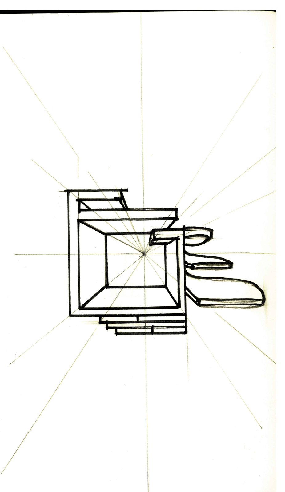
4.
Creating a sense of admiration is to build cubic in symmetry.
5. Different height of walls is critical for the continuity of space and view.
6. The ceiling can be manipulating to define a special space or allow light entering the building.
Combination
1.
2.
3.
Selected
Rail Light Station Model


Mies van der Rohe and Peter Zumthor were famous architecture. It’s my first time to appreciate their works. They are amazing. For Mies van der Rohe, his architectures are simple but powerful. He always uses simple straight lines to construct buildings and uses lots of glasses and columns to strengthen the relationship between natural and human beings. But Peter Zumthor’s constructions are completely different. Peter likes to think about humanity like how’s their feeling when they appreciate the building. If we get into his building, we might find that the interior and exterior of the building are different. It feels like we get from one world to another and gives strong resonance for the visitor. Technically, they are both the master of controlling light with the transparent material.
I decide to build a simple and effective station by using two concepts which I draw from Mies van der Rohe. One of them is diminishing the boundaries to extend the volume and space for the station, and another one is to controlling spatial communication and views by using the different height of walls. The main structure of the station was made by the first concept and decorated by some walls.
Texture
Selected

This material was used to build light train way which has high contrast to the texture of dark marble at the bank of the way. The simple straight lines intercept with each other warning people do not get close to this area.
This texture was applied to a circular lounge where it is under the rail light way. It is a transparent material which allows dimly light entering the lounge and It looks like petals and let pedestrians feel more comfortable to have a rest just like sitting in nature.
I placed this material on the wall where it is at the main street of the university. As you can see, these two lines give direction to the wall which helps separate the space for pedestrians. The left side of the wall is designed for people who wants to cross the road and the right side is for people to turn right.
Lumion files:
https://1drv.ms/f/s!As9gdJXIqUeSrWqBCBgUUc8dGnYY
SketchUP file:
https://3dwarehouse.sketchup.com/model/2a04e2c8-759e-43c8-a2e5-2872b074d6b4/ARCH1101-EXP2-2017-Wenchao-WU